Hoot Front-End Style the Sign-Up and Sign-In Pages
Learning objective: By the end of this lesson, students will be able to style sign-up and sign-in components with CSS modules.
Style the SignUpForm component
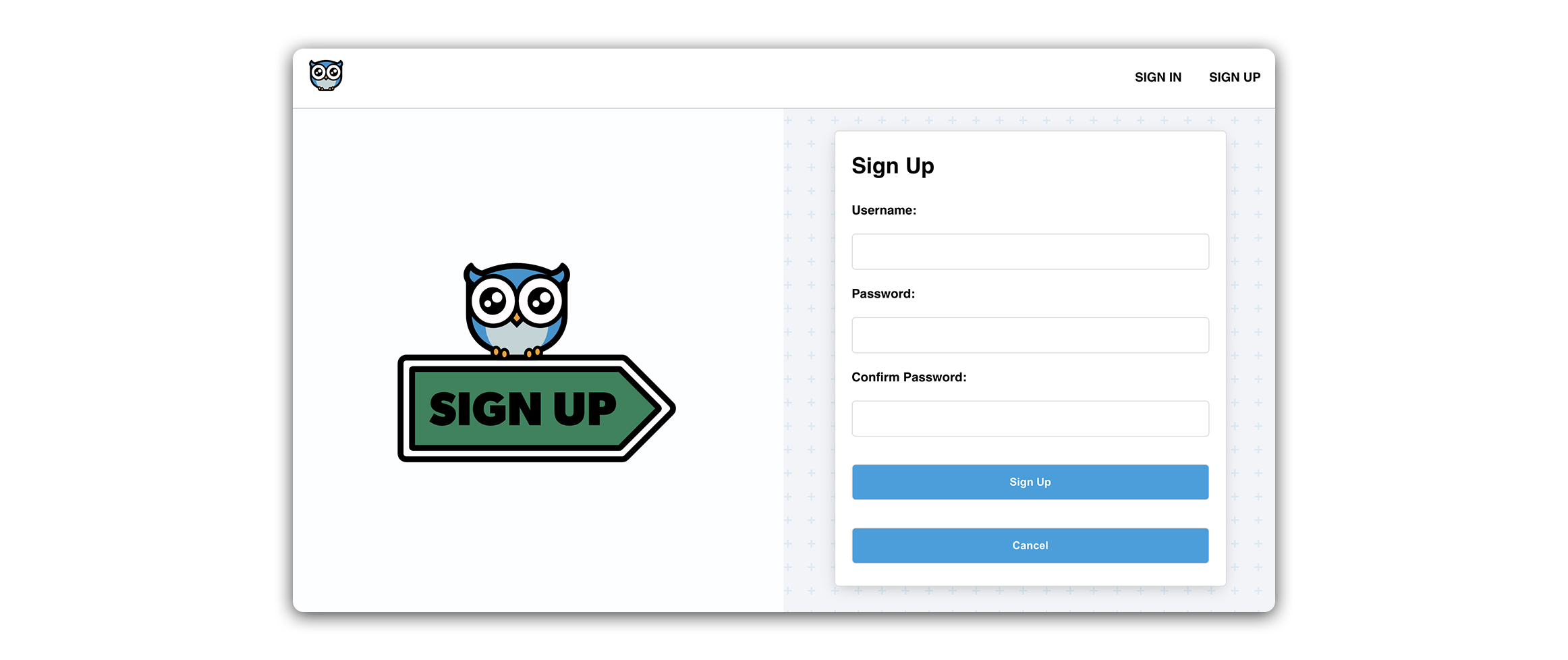
Let’s add some styling to our SignUpForm!
The SignUpForm and SignInForm pose an interesting design challenge. Generally, the elements of these forms are arranged in a narrow column, which is great for mobile devices, but can result in a lot of unused space on desktop screens.
To address this, we’ll modify our desktop layout by incorporating a large graphic alongside our SignUpForm and SignInForm. This will help us utilize the horizontal space more effectively. To maintain a clean and functional design on mobile devices, we’ll employ media queries to hide the graphic on smaller screens. This will ensure that our forms are visually appealing and space-efficient across different devices.
Refactor SignUpForm
Before we add styling to The SignUpForm component, we’ll need to make a few changes to its JSX structure. This will help facilitate a specific flex layout we are working towards.
Take a look at the current structure of src/components/SignUpForm/SignUpForm.jsx:
<main>
  <h1></h1>
  <p></p>
  <form>...</form>
</main>
Notice how we have a single container - <main>, with several child elements inside it. If we restrict ourselves to flexbox, these child elements can be generally arranged in a column or row.
In our desired layout, we want two distinct sections of the page, side by side one another in a row:
<main>
  <section>
    <img />
  </section>
  <section>
    <form>...</form>
  </section>
</main>
On the right-hand side of the screen, we’ll display our sign-up form component, while on the left, we’ll display a decorative image directing the user to sign up with the form.
Let’s take this step by step.
First, move the <h1> and <p> tags inside the <form> like so:
// src/components/SignUpForm/SignUpForm.jsx

<form onSubmit={handleSubmit}>
  <h1>Sign Up</h1>
  <p>{message}</p>
Next, wrap the <form> in a <section> tag
// src/components/SignUpForm/SignUpForm.jsx

<section>
  <form onSubmit={handleSubmit}>
At the top of the SignUpForm component, import the SignUpIcon SVG file:
// src/components/SignUpForm/SignUpForm.jsx

import SignUpIcon from '../../assets/images/signup.svg';
Next, add the following <section> and <img> tag. The <section> should be placed inside <main>, directly above the <section> containing the <form>:
// src/components/SignUpForm/SignUpForm.jsx

<main>
  <section>
    <img src={SignupIcon} alt='An owl sitting on a sign' />
  </section>
Now, we have two distinct elements that can sit side by side within their shared parent container, which is a perfect setup for the flex layout we will be applying in the next step.
Add the module
Run the following command in your terminal:
touch src/components/SignUpForm/SignUpForm.module.css
Add the following to the new file:
/* src/components/SignUpForm/SignUpForm.module.css */

.container {
  height: 100%;
  display: flex;
  align-items: center;
}

.container p {
  margin: 0;
  padding: 0px 0 10px;
}

.container img {
  width: 65%;
  max-width: 500px;
}

.container section {
  width: 50%;
  height: 100%;
  display: flex;
  padding: 28px 21px;
  align-items: center;
  flex-direction: column;
}

.container section:first-child {
  height: 100%;
  align-items: center;
  justify-content: center;
  background-color: #fdfeff;
}

.container section:nth-child(2) {
  overflow: scroll;
  justify-content: center;
}

.container input {
  margin: 7px 0px 14px 0px;
}

.container input,
button {
  width: 100%;
  padding: 14px;
  font-size: 14px;
  border-radius: 5px;
  border: 1px solid rgb(220, 220, 220);
}

.container div {
  width: 100%;
  display: flex;
  flex-direction: column;
}

.container label {
  font-weight: 600;
  margin: 7px 0px 14px 0px;
}

.container button {
  color: white;
  font-weight: 600;
  background: #00a0df;
  margin: 21px 0px 0px 0px;
}

.container a {
  border: none;
  font-size: 14px;
  background: none;
  font-weight: 500;
  margin-top: 14px;
  text-align: center;
  color: rgb(200, 200, 200);
}

input:focus {
  outline: none;
  border: 1px solid #00a0df;
}

@media only screen and (max-width: 912px) {
  .container section {
    width: 100%;
  }
  .container section:first-child {
    display: none;
  }
  .container form {
    min-width: 100%;
  }
}

@media only screen and (max-height: 900px) {
  .container section:nth-child(2) {
    justify-content: flex-start;
  }
}
The above stylesheet gives us a two-column layout on desktop and, through media queries, a single-column layout on mobile. When we switch to a mobile layout (max-width: 912px), we apply display: none; to the left-side section containing our graphic. This effectively removes the image from our layout when it is no longer necessary as a placeholder.
We also have some interesting CSS selectors here with :first-child and :nth-child(2).
The .container section:first-child selector targets the first section that is a direct child of .container class, while the .container section:nth-child(2) selector targets the second section child of .container.
This is just a way of applying variations to the left and right sections of the page without additional class names.
You might also notice the use of overflow: scroll. This grants our form section a scrollable overflow. This can be useful when a UI element with a set width or height might contain more content than can be displayed within the available area.
Apply styles
Add the following import to src/components/SignUpForm/SignUpForm.jsx:
// src/components/SignUpForm/SignUpForm.jsx

import styles from './SignUpForm.module.css';
And apply styles.container to the className of the outermost element (<main>):
// src/components/SignUpForm/SignUpForm.jsx

<main className={styles.container}>
Check out the page in your browser!
Style the SignInForm component
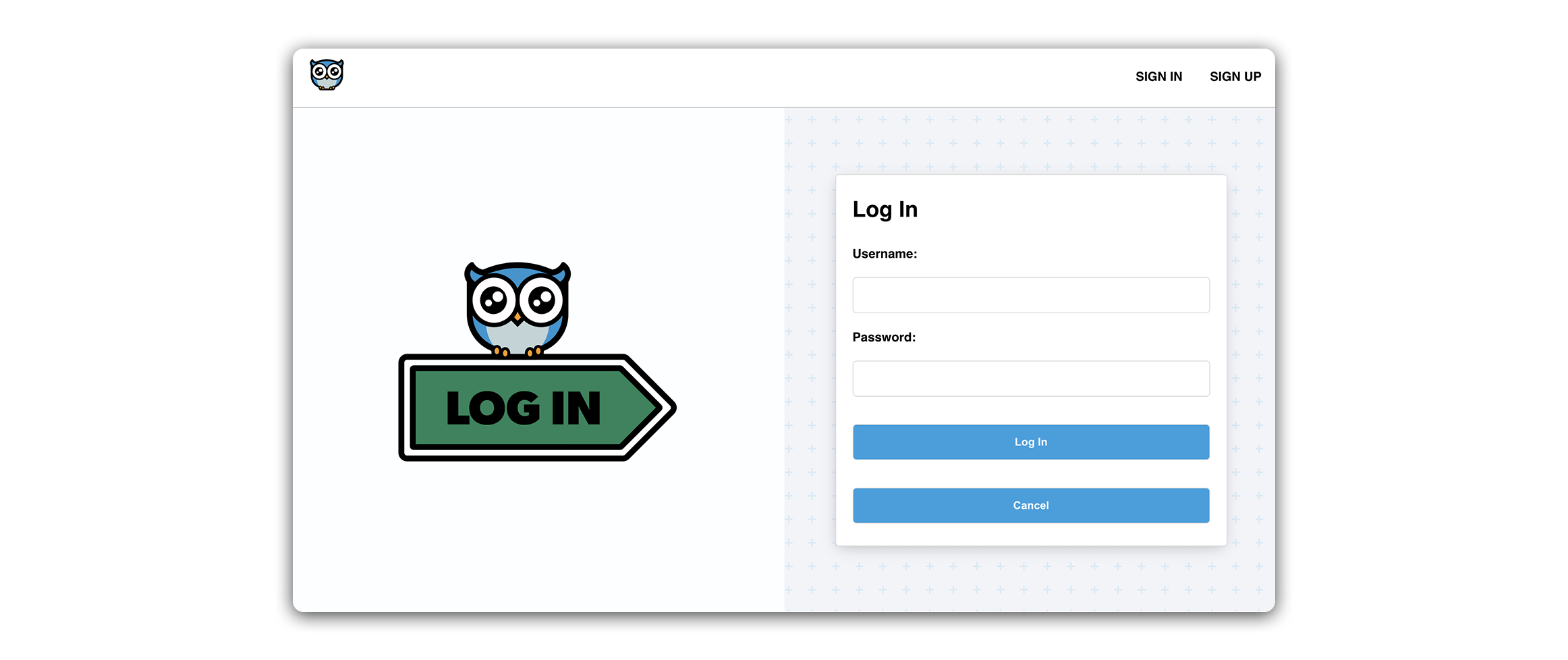
Let’s apply the same changes to the SignInForm component. Our layout here will be quite similar to Sign up, but we’ll include a brand new stylesheet for simplicity. We’ll also include a ‘Login’ specific graphic.
Refactor the SignInForm component
First, we’ll refactor the form.
Once again, we move the <h1> and <p> inside the <form> tag, and wrap the <form> in a <section>:
// src/components/SignInForm/SignInForm.jsx

<section>
  <form autoComplete='off' onSubmit={handleSubmit}>
    <h1>Sign In</h1>
    <p>{message}</p>
Next, import the LoginIcon SVG file:
// src/components/SignInForm/SignInForm.jsx

import LoginIcon from '../../assets/images/login.svg';
And add the following <section> and <img>:
// src/components/SignInForm/SignInForm.jsx

<main>
  <section>
    <img src={LoginIcon} alt='An owl sitting on a sign' />
  </section>
Run the following command in your terminal:
touch src/components/SignInForm/SignInForm.module.css
Add the following to the new file:
/* src/components/SignInForm/SignInForm.module.css */

.container {
  height: 100%;
  display: flex;
  overflow: hidden;
  align-items: center;
}

.container p {
  margin: 0;
  padding: 0px 0 10px;
}

.container img {
  width: 65%;
  max-width: 500px;
}

.container section {
  width: 50%;
  height: 100%;
  display: flex;
  padding: 28px 21px;
  align-items: center;
  flex-direction: column;
  justify-content: center;
}

.container section:first-child {
  background-color: #fdfeff;
}

.container input {
  margin: 7px 0px 14px 0px;
}

.container input,
button {
  width: 100%;
  padding: 14px;
  font-size: 14px;
  border-radius: 5px;
  border: 1px solid rgb(220, 220, 220);
}

.container div {
  width: 100%;
  display: flex;
  flex-direction: column;
}

.container label {
  font-weight: 600;
  margin: 7px 0px 14px 0px;
}

.container button {
  color: white;
  font-weight: 600;
  background: #00a0df;
  margin: 21px 0px 0px 0px;
}

.container a {
  border: none;
  font-size: 14px;
  background: none;
  font-weight: 500;
  margin-top: 14px;
  text-align: center;
  color: rgb(200, 200, 200);
}

input:focus {
  outline: none;
  border: 1px solid #00a0df;
}

@media only screen and (max-width: 912px) {
  .container section {
    width: 100%;
    justify-content: flex-start;
  }
  .container section:first-child {
    display: none;
  }
  .container form {
    min-width: 100%;
  }
}
Add the following import to the SignInForm component:
// src/components/SignInForm/SignInForm.jsx

import styles from './SignInForm.module.css';
And apply styles.container to the className of the outermost element (<main>):
// src/components/SignInForm/SignInForm.jsx

<main className={styles.container}>
Try signing in or signing up in your browser!