Hoot Front-End Build a Reusable Metadata Component
Learning objective: By the end of this lesson, students will be able to build a reusable metadata component.
Overview
In this lesson, we’ll build a reusable metadata component called AuthorInfo.
The term ‘metadata’ refers to data that provides information about other data. In the context of online content such as blog posts or comments, metadata will often include information on the content’s author, such as their name and the date the content was created.
Throughout our application, we are currently rendering this information with a <p> tag:
<p>
  {`${hoot.author.username} posted on
  ${new Date(hoot.createdAt).toLocaleDateString()}`}
</p>
Our AuthorInfo component will replace this <p> tag with a more refined layout and styling. This will make it easier to display information about an author in a visually consistent manner across the app.
Both hoots and comments will be able to use the AuthorInfo component. As a result, AuthorInfo is built to receive a generic content prop so as not to mislabel either of these resources.
The AuthorInfo component will also display the createdAt property of a resource and a ProfileIcon image representing the author.
Take a look at the component hierarchy diagram below for context on how AuthorInfo fits into our component tree:
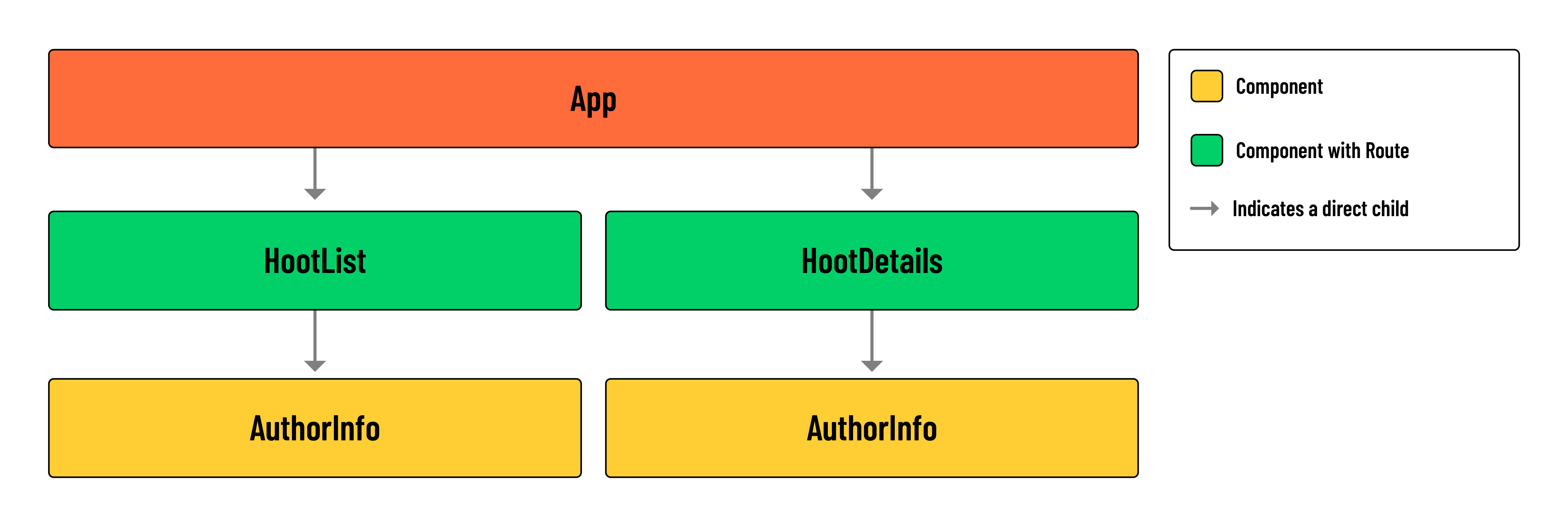
💡 In the
HootListcomponent, an instance ofAuthorInfowill be produced for eachhootas wemap()over thehootsarray. The same will apply to thehoot.commentsrendered inside of theHootDetailscomponent. A stand-alone instance ofAuthorInfowill also be rendered at the top ofHootDetails, alongside details of a singlehoot.
Build the component
Let’s build the component!
Run the following commands in your terminal:
mkdir src/components/AuthorInfo
touch src/components/AuthorInfo/AuthorInfo.jsx
touch src/components/AuthorInfo/AuthorInfo.module.css
Add the following to the new CSS module file:
/* src/components/AuthorInfo/AuthorInfo.module.css */

.container {
  display: flex;
  align-items: center;
  justify-content: flex-start;
}

.container * {
  margin: 0;
}

.container div {
  margin: 0 !important;
}

.container > img {
  width: 30px;
  height: 30px;
  object-fit: cover;
  margin-right: 12px;
  border-radius: 50%;
  background-color: var(--background);
}

.container section > p {
  opacity: 0.75;
  line-height: 1;
  font-size: 14px;
  font-weight: bold;
  margin-bottom: 2px;
}

.container div p {
  line-height: 0.8;
  font-size: 11px;
  font-weight: 600;
  letter-spacing: 1px;
}

.container section {
  display: flex;
  flex-direction: column;
}

.container section img {
  opacity: 0.5;
  width: 14px;
  height: 14px;
  background: none;
  margin: 0 2px 0 -2px;
}
Add the following to the new AuthorInfo component:
// src/components/AuthorInfo/AuthorInfo.jsx

import styles from './AuthorInfo.module.css';
import ProfileIcon from '../../assets/images/profile.png';
import Icon from '../Icon/Icon';

const AuthorInfo = ({ content }) => {
  return (
    <div className={styles.container}>
      <img
        src={ProfileIcon}
        alt="The user's avatar"
      />
      <section>
        <p>{content.author.username}</p>
        <div className={styles.container}>
          <Icon category='Calendar' />
          <p>{new Date(content.createdAt).toLocaleDateString()}</p>
        </div>
      </section>
    </div>
  );
};

export default AuthorInfo;
💡 Because our application does not include photo upload, we’ll make use of a generic
ProfileIconSVG in place of a profile picture.
Apply the metadata component
Add the following import to src/components/HootList/HootList.jsx:
import AuthorInfo from '../../components/AuthorInfo/AuthorInfo';
In src/components/HootList/HootList.jsx, locate the following <p> tag:
// src/components/HootList/HootList.jsx

<p>
  {hoot.author.username} posted on
  {new Date(hoot.createdAt).toLocaleDateString()}
</p>

</header>
<p>{hoot.text}</p>
Replace this tag with the <AuthorInfo /> component, passing down content={hoot}:
// src/components/HootList/HootList.jsx

  <AuthorInfo content={hoot} />
</header>
<p>{hoot.text}</p>
Add the following import to the HootDetails component:
// src/components/HootDetails/HootDetails.jsx

import AuthorInfo from '../../components/AuthorInfo/AuthorInfo';
Locate the existing <p> tag this component:
// src/components/HootDetails/HootDetails.jsx

<p>
  {`${hoot.author.username} posted on
  ${new Date(hoot.createdAt).toLocaleDateString()}`}
</p>
And replace this tag with the <AuthorInfo /> component, passing down content={hoot}:
// src/components/HootDetails/HootDetails.jsx

<header>
  <p>{hoot.category.toUpperCase()}</p>
  <h1>{hoot.title}</h1>
  <div>
    <AuthorInfo content={hoot} />
    {hoot.author._id === user._id && (
      <>
        <Link to={`/hoots/${hootId}/edit`}>
          <Icon category='Edit' />
        </Link>
        <button onClick={() => props.handleDeleteHoot(hootId)}>
          <Icon category='Trash' />
        </button>
      </>
    )}
  </div>
</header>
Notice how we label hoot as content when passing props to <AuthorInfo>. We do this because we’ll reuse the AuthorInfo component for our comments as well. Thankfully, the shape of a hoot and comment are similar enough that we don’t need to adjust any code inside the AuthorInfo component. By mapping hoot and a comment to a generic content prop, we avoid misrepresenting the data type or data source used in the component.
Next, we can add the <AuthorInfo /> component to our list of comments, replacing the existing <p> tag.
Update the HootDetails component as shown below:
// src/components/HootDetails/HootDetails.jsx

{
  hoot.comments.map((comment) => (
    <article key={comment._id}>
      <header>
        <div>
          <AuthorInfo content={comment} />
          {comment.author._id === user._id && (
            <>
              <Link to={`/hoots/${hootId}/comments/${comment._id}/edit`}>
                <Icon category='Edit' />
              </Link>
              <button onClick={() => handleDeleteComment(comment._id)}>
                <Icon category='Trash' />
              </button>
            </>
          )}
        </div>
      </header>
      <p>{comment.text}</p>
    </article>
  ));
}
Check out the changes we made in your browser. You should now have a fully developed application.
Congratulations! You’ve reached the end of this code-along!