Hoot Front-End Build a Reusable Icon Component
Learning objective: By the end of this lesson, students will be able to build a reusable icon component.
Overview
In this lesson, we’ll build a reusable icon component. This component should make it easier to access SVG assets across components in our app.
If you look at the src/assets/images directory, you’ll notice several icons. Most of these will actually be used to visually indicate the category of a hoot on the list page. Conditionally rendering each icon based on the value of hoot.category would be cumbersome. Thankfully, our Icon component will streamline this process.
Instead of importing the asset and building out a new <img> tag, we can just provide the Icon component with a category prop. The category prop is just a string. The component uses that category string to access an svg value stored in the icons object, and renders the target svg as an image.
Additionally, we’ll be able to use the Icon component for UI elements, like ‘Delete’ buttons and ‘Edit’ links.
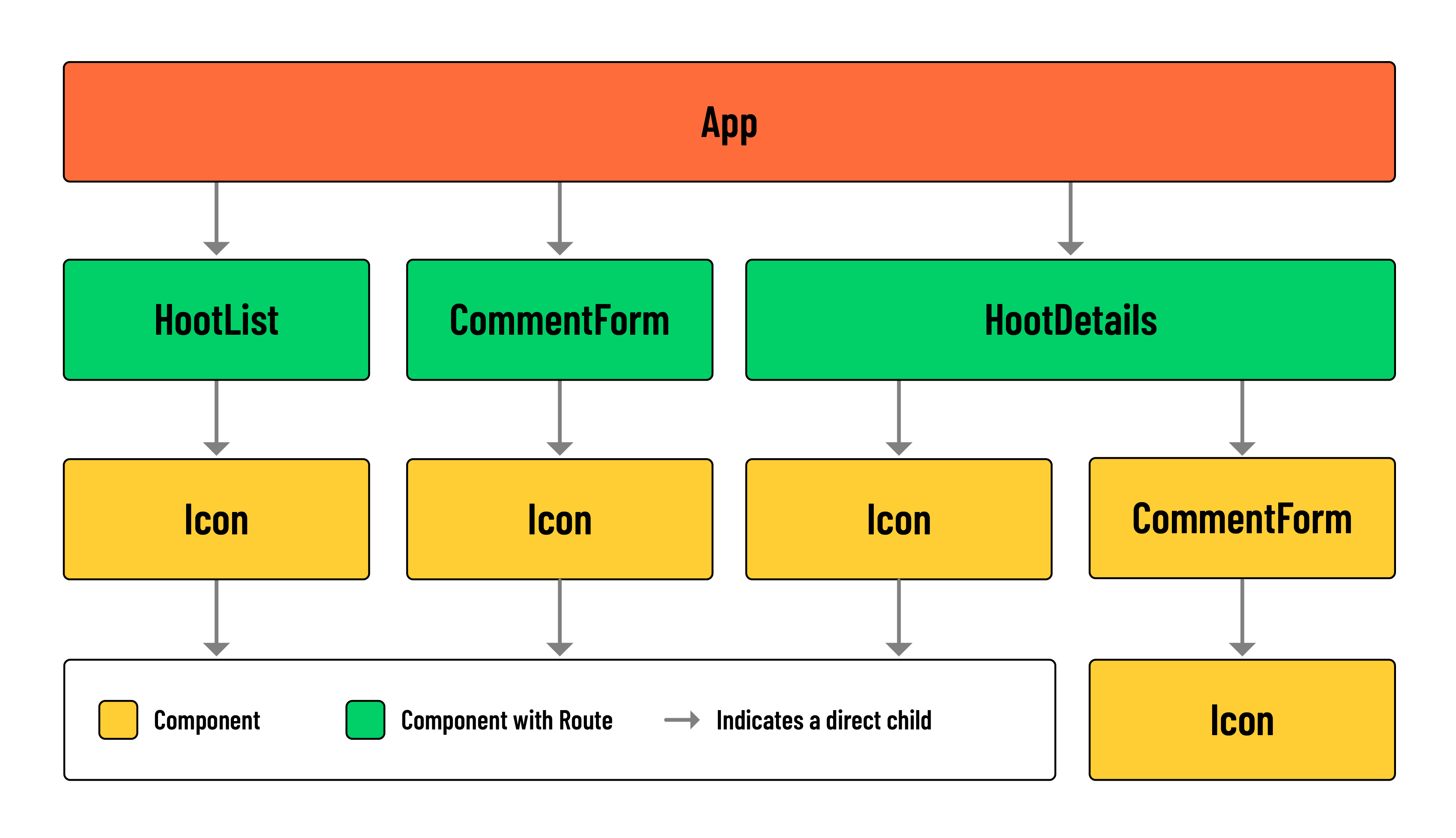
Build the component
Run the following commands in your terminal:
mkdir src/components/Icon
touch src/components/Icon/Icon.jsx
Add the following to src/components/Icon/Icon.jsx:
// src/components/Icon/Icon.jsx

import Add from '../../assets/images/add.svg';
import Edit from '../../assets/images/edit.svg';
import News from '../../assets/images/news.svg';
import Like from '../../assets/images/like.svg';
import Liked from '../../assets/images/liked.svg';
import Music from '../../assets/images/music.svg';
import Games from '../../assets/images/games.svg';
import Trash from '../../assets/images/trash.svg';
import Movies from '../../assets/images/movies.svg';
import Sports from '../../assets/images/sports.svg';
import Create from '../../assets/images/create.svg';
import Comments from '../../assets/images/comments.svg';
import Calendar from '../../assets/images/calendar.svg';
import Televison from '../../assets/images/television.svg';

const Icon = ({ category }) => {
  const icons = {
    Add: Add,
    News: News,
    Like: Like,
    Edit: Edit,
    Music: Music,
    Games: Games,
    Liked: Liked,
    Trash: Trash,
    Movies: Movies,
    Sports: Sports,
    Create: Create,
    Calendar: Calendar,
    Comments: Comments,
    Television: Televison,
  };

  return (
    <img
      src={icons[category]}
      alt={`A ${category} icon.`}
      id={category.toLowerCase()}
      className='icon'
    />
  );
};

export default Icon;
Let’s break down how this component works.
This Icon component dynamically selects and renders an SVG based on the provided category prop. Every SVG icon we’ll need in our application has been imported here and stored in an object called icons. Each key in the icons object maps to a corresponding category name.
When the component is used, it receives a category prop that specifies the icon to display. Using bracket notation, the component looks up the category in the icons object and finds the associated SVG file.
This SVG file is then set as the src attribute of an <img> element. The alt and id attributes are also dynamically set to describe the icon based on the value of the category.
For example, say we wanted to display the News SVG somewhere in our application. We would import our <Icon> component, add it to the return, and specify the SVG we wish to display using the category prop as demonstrated below:
<Icon category='News' />
Accessing SVGs with the category prop
Now, let’s put the Icon component to use.
Add the following import to the top of the HootList component:
// src/components/HootList/HootList.jsx

import Icon from '../Icon/Icon';
Next, locate the <h2> containing the hoot.title:
// src/components/HootList/HootList.jsx

<h2>{hoot.title}</h2>
Wrap this element in a <div>, and place the newly imported <Icon /> directly beneath it:
// src/components/HootList/HootList.jsx

<article>
  <header>

    <div>
      <h2>{hoot.title}</h2>
      <Icon />
    </div>
Next, we’ll need to pass a category down to the <Icon />:
// src/components/HootList/HootList.jsx

<article>
  <header>

    <div>
      <h2>{hoot.title}</h2>
      <Icon category={hoot.category} />
    </div>
In your browser, navigate to the list page. For each hoot in the list, you should now have an SVG icon representing that hoot’s category.
Add the Icon to UI elements
This component can be applied to interactive UI elements as well. Let’s use it to improve each instance of ‘Edit’ and ‘Delete’ in the HootDetails component. Start by importing the Icon component at the top of the file:
// src/components/HootDetails/HootDetails.jsx

import Icon from '../Icon/Icon';
Update the ‘Edit’ and ‘Delete’ elements with the following:
// src/components/HootDetails/HootDetails.jsx

<>
  <Link to={`/hoots/${hootId}/edit`}>
    <Icon category='Edit' />
  </Link>
  <button onClick={() => props.handleDeleteHoot(hootId)}>
    <Icon category='Trash' />
  </button>
</>
You’ll notice an immediate advantage to this approach - it minimizes the number of imports we need to make in each component.
Let’s make the same changes to the UI elements in our comments section:
// src/components/HootDetails/HootDetails.jsx

<>
  <Link to={`/hoots/${hootId}/comments/${comment._id}/edit`}>
    <Icon category='Edit' />
  </Link>
  <button onClick={() => handleDeleteComment(comment._id)}>
    <Icon category='Trash' />
  </button>
</>
And to wrap up, head over to the CommentForm component.
Add the following import:
// src/components/CommentForm/CommentForm.jsx

import Icon from '../Icon/Icon';
And replace the text content of the <button> with the <Icon />
// src/components/CommentForm/CommentForm.jsx

<button type='submit'>
  <Icon category='Create' />
</button>
Check out the changes we made in your browser!